Tbilisi, Georgia (GMT+4)

Skippit: Notifications redesign
Product Thinking
User Interviews
Usability Testing
Details
My Role
Senior Product Designer (IC)
Team
Product Owner, Engineers
Timeline
~3–4 weeks
Platform
Web (B2B SaaS)
Methods
User interviews · usability testing · Wireframing · UI
Background
Skippit started as an internal software built at Redberry, an all-in-one tool for digital agencies to manage staffing, time-off approvals, invoicing, project tracking, and financial reporting.
As the business began exploring how Skippit could work for external agencies, the product team used that window to step back and validate years of internal decisions instead of continuing to add features.
The problem hiding in plain sight

Skippit had strong utility, but the notification experience was failing users where timing mattered most. Urgent actions, routine updates, and FYI messages were all funneled into one list, making it hard to tell what actually needed attention.
During interviews, users described the same pattern in different ways:
"Notification messages are not categorized. Requests and reminders are all mixed together." - 2 PMs
"Mail notifications feel like spam." - PM
"Sometimes I miss time-off requests. It would be nice to have an alert when the start date is approaching and the request is still pending." - PM
Because users couldn’t quickly identify what mattered and procrastinated, some started relying on email, external reminders, or verbal follow-ups instead of the platform. The result was delayed approvals, stale project data, and teams having to double-check information outside Skippit before taking action.
Research

Our Respodents
I worked with the Product Owner to define the areas that needed investigation, then ran interviews with 10 users across PM, CFO, HR, and Sales roles. We chose semi-structured interviews. Structured enough to compare across participants, flexible enough to probe deeper into unexpected insights.
After the interviews, I grouped findings by module and mapped issues to user flows. Notifications emerged as the densest problem area, though we also found friction across Projects & Terms, Invoicing, Time Offs, and Reports.
Key insights:
Everything had equal visual weight. Urgent items sat next to low-priority updates with nothing to distinguish them.
Users didn’t fully trust the system. "Sometimes I get updated late on project term changes. Notification when something changes would solve this." - PM + 2 CFOs. Some relied on email, spreadsheets, or conversation to confirm whether information was current.
The issue was usability, not utility. The feature existed, but it wasn’t helping users act efficiently or confidently.
Framing the problem
Before ideation, the team aligned on a shared problem statement and clear success criteria.
How might we help users easily recognize what’s urgent vs routine so they’re encouraged to act on time?
Success looked like:
Effectiveness - More urgent items correctly identified
Efficiency - Faster time to first correct action
Satisfaction - Higher confidence and ease-of-use ratings.
Solution direction
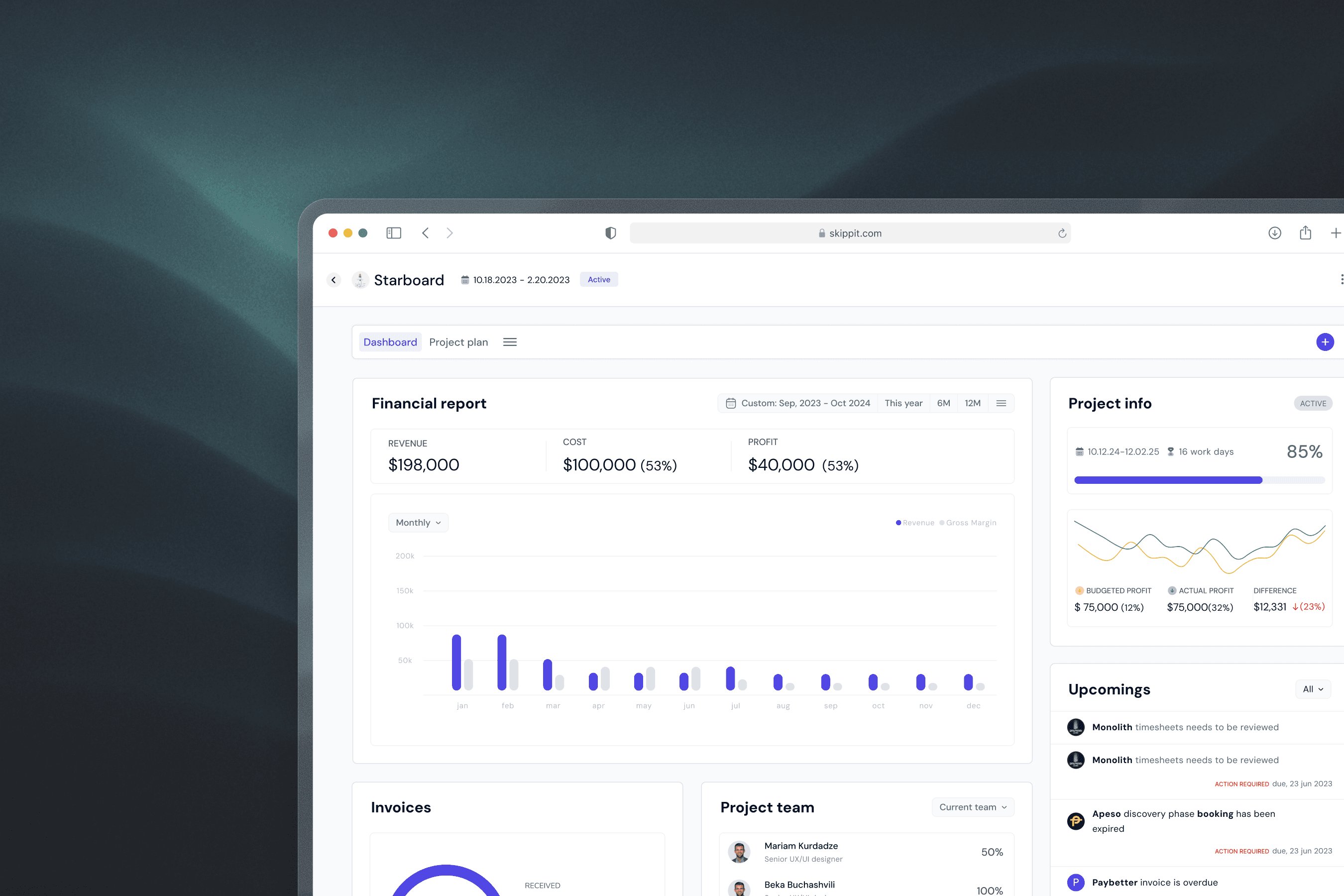
Instead of improving the notification list itself, I shifted the concept toward surfacing time-sensitive actions in a dedicated dashboard area organized by context rather than chronology.
The dashboard was structured into two zones:
Left - Financial snapshot.
Right - Three action-focused modules for time-sensitive tasks
This reduced the need for users to scan, sort, and mentally prioritize a crowded inbox. The system did more of that upfront.
Validation
I tested the current implementation against the new design using a within-subject usability test with 6 participants from the original research group.
Task: "You have 2 minutes. Find what needs action today and do what you need to do next."
Results
Metric
Result
Time to first correct action
New design was ~6 seconds faster on average (median: 8s)
Urgency recognition (effectiveness)
5/6 succeeded on both; 1 succeeded only on new design
Ease of use (satisfaction)
New design rated ~2.3 points easier on a 1–5 scale
The new design was faster and easier to use while maintaining task success.
The speed and satisfaction gains were consistent. The effectiveness result - 5/6 succeeding on both, showed the new design matched the old one on task success while being meaningfully faster and significantly easier to navigate.
What we iterated after testing
Testing showed that PMs sometimes needed to focus on one project rather than an aggregated dashboard view. Instead of adding more filtering to the main dashboard, I designed the same structure as an isolated per-project view.
What shipped


Next Project
👇

Invite team members


Tablet
Mobile


tornike.shvangiradze@gmail.com
Email copied